How to Create Excel Charts (Column or Bar) with Conditional Formatting
Written by
Reviewed by
This tutorial will demonstrate how to create Excel charts with conditional formatting in all versions of Excel: 2007, 2010, 2013, 2016, and 2019.
In this Article
Conditional formatting is the practice of assigning custom formatting to Excel cells—color, font, etc.—based on the specified criteria (conditions). The feature helps in analyzing data, finding statistically significant values, and identifying patterns within a given dataset.
But unfortunately, Excel doesn’t offer any built-in tools for applying conditional formatting to Excel charts.
However, with a drop of spreadsheet magic, no problem is insurmountable. In this tutorial, you will learn how to create a dynamic chart with conditional formatting where the plotted data points are automatically formatted based on their respective actual values.
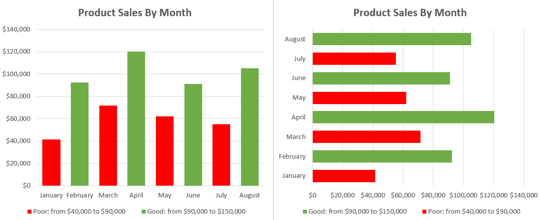
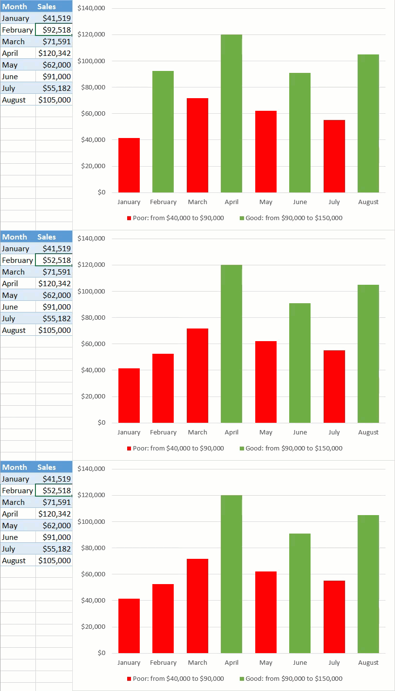
As an example, take a look at this column chart, breaking down the performance of a sales manager over a period of eight months. Notice how the color of the column automatically adjusts depending on its underlying value:
Getting Started
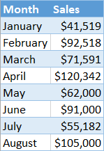
Consider this sample dataset containing sales performance data:
Before we begin, move your dataset around so that you have three empty rows above the table with your raw data. The rows are going to be used for setting conditional formatting rules.
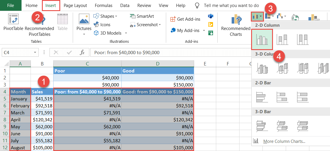
Step #1: Prep chart data.
In order to make things work, you need to add some extra chart data to the equation. For your convenience, take a peek at how your chart data should look like by the end of the preparation phase:
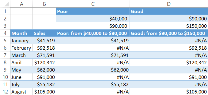
Our first step is defining the boundary values (conditions) that should split the actual values into multiple categories, making it possible to chart them as separate data series.
From the screenshot above, for instance, you can see that the sales figures for a given month have to fall within the range of $90,000 to $150,000 to be considered satisfactory.
To create the rules, use the three empty rows above the dataset:
- Row 1 (Label): Use these cells for labeling the formatting rules.
- Row 2 (Min. Value): The values in this row define the lower boundary for each condition.
- Row 3 (Max. Value): Likewise, these values set the upper boundaries.
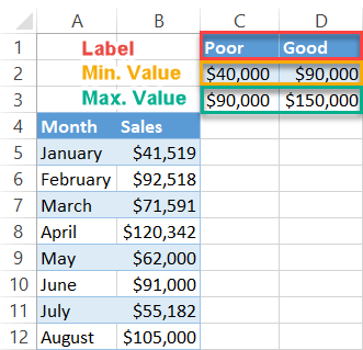
With this method, you can create as many conditional formatting rules as you please—just make sure the value ranges don’t overlap.
As you keep inching forward in setting up your chart, design custom chart legend items that will provide context for the chart. Enter this formula into C4 and copy it across to D4 by dragging the fill handle:
=C1&": from "&TEXT(C2, "$#,##")&" to "&TEXT(C3, "$#,##")The formula puts together a neatly-looking dynamic label based on the previously set conditional formatting rules. The TEXT function formats the values as currency. But if your data type differs, apply this formula instead:
=C1&": from "&TEXT(C2, "#,##")&" to "&TEXT(C3, "#,##")Or this one when you work with percentages:
=C1&": from "&TEXT(C2, "#%")&" to "&TEXT(C3, "#%")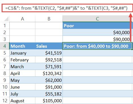
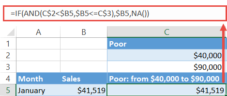
Finally, find the chart values. Type the following formula into C5, copy it down to C12 and across to the matching cells in column D:
=IF(AND(C$2<$B5,$B5<=C$3),$B5,NA())The formula compares a given actual value in column B against the specified boundary values with the help of the IF and AND functions. If the value falls within the range, it gets copied into this column. Otherwise, the formula returns the #N/A error to prevent the same value from being plotted multiple times.
Step #2: Set up a column chart.
Having gathered all the chart data, set up a simple column chart—or a bar chart as an alternative:
- Highlight all the chart data except for the columns containing the actual values and the rules by holding down the Ctrl key (A4:A12 and C4:D12).
- Go to the Insert tab.
- Select “Insert Column or Bar Chart.”
- Choose “Clustered Column/Clustered Bar.”
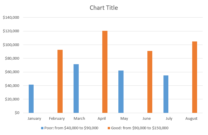
As a result, you will end up with a chart with data points plotted based on the conditional formatting rules—just as promised:
Step #3: Modify the Overlap and Gap Width values.
Before closing this tutorial, fix the issue of the misplaced columns caused by the invisible empty values (the #N/A errors) plotted on the chart.
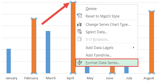
Right-click on any of the columns and pick “Format Data Series” from the contextual menu that pops up.
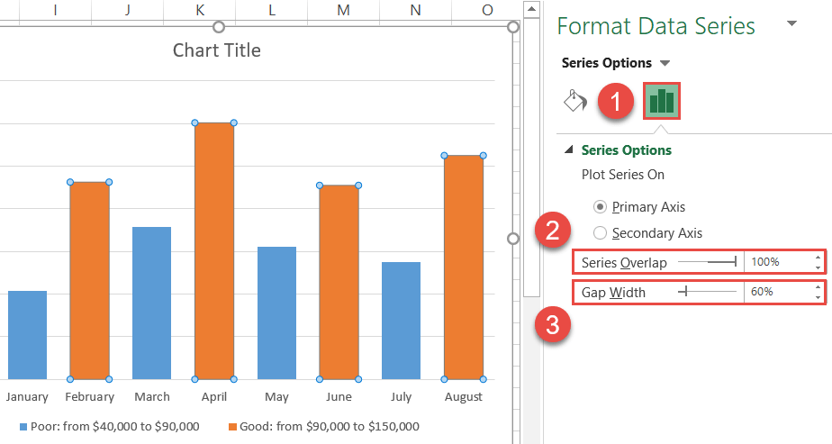
In the task pane, change the position and width of the columns:
- Switch to the Series Options tab.
- Change “Series Overlap” to “100%.”
- Set the Gap Width to “60%.”
Step #4: Adjust the color scheme.
At last, add the final touches. Without closing the Format Data Series task pane, modify the color scheme of the chart:
- Go to the Fill & Line tab.
- Under “Fill,” choose “Solid fill.”
- Click the “Fill Color” icon and pick green from the color palette.
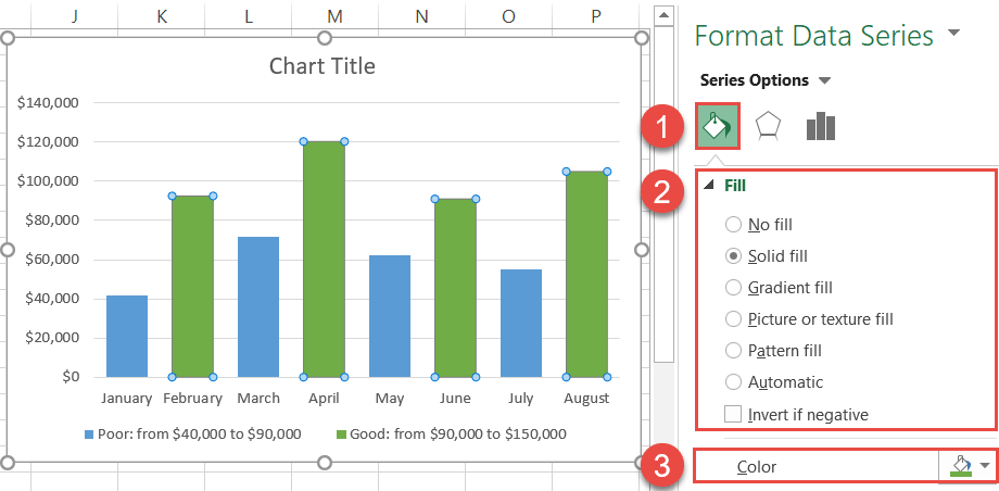
Once there, recolor the other data series, change the chart title, and your fully dynamic chart with conditional formatting is ready to go!
